
When creating art, the colors you select are a crucial part of the process. Though we may not realize it, when it comes to color selection there are no accidents. Color theory is the practical guide to mixing and selecting colors. It is where science collides with art, explaining how humans perceive colors and the messages that are communicated to the brain through color. It shows how different colors match, mix and even contrast.
As an artist, you may be wondering why you should care about color theory. Surely art is about expression and does not have any rules, right? You are right that art has no rules, however, the understanding of color theory provides the perfect guidelines on how you can create art that is perceived in the way you desire. Color theory sets the perfect foundation for impactful art.
This article will explain everything you need to know about color theory so your art can reach its full potential.
Color Theory Made Simple
In order to properly understand color theory, there are a few terms we need to get familiar with. As an artist, you are probably familiar with these terms already, but there is no harm going over them to aid our understanding of color theory further.
- Hue – Hue simply refers to a color or shade.
- Saturation – The intensity of a color.
- Value – The degree of lightness and darkness.
- Shade – A hue produced by adding black.
- Tint – A hue produced by adding white.
- Tone – A hue produced by adding gray.
Why Is Color Theory Important?
Wonder how you can utilize color to benefit your art? Here are why colors are so crucial, and how they can be utilized to your advantage.
Set the mood
Colors can be used to tell a story and are the perfect way of setting the tone for your piece. Naturally, we associate colors with different emotions. Cool tones are perceived as dark, sad, gloomy, and mysterious. Whereas warm colors are bright, cheerful, and happy. Of course, this is a generalization and is not always the case, but it’s a good guideline to follow when selecting colors and the feelings you would like to convey in your artwork.
Draw attention
Color is the perfect way to draw attention to a specific part of your artwork. If there is a detail, object, or person that you want the audience to notice, the perfect way to achieve this is through your selection of color.
Composition
If you want to draw attention to the foreground or background, using a contrasting color can allow you to achieve this. Color helps to guide the line of vision and highlights important aspects you may want to be identified. With color, you can direct the viewer’s gaze through your work.
Color Schemes & Harmonies: Which Colors Go Together?
Color combinations are vital. They can make or break your artwork. Here are a few color combinations to answer the age-old question, which colors go together?
Monochromatic
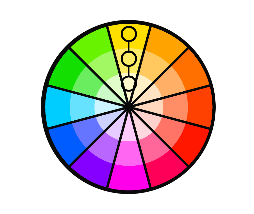
This is when you use only one color in the entire image. You start with the color and add white or gray to create a variety of different tones and shades. As they are created from the same color, they naturally complement each other effortlessly. This is best used for single subjects as it forces you to concentrate on the detail of the artwork. It helps to bring attention to the story or message of your art as the viewer will not be distracted by an array of colors.
Complementary Colors
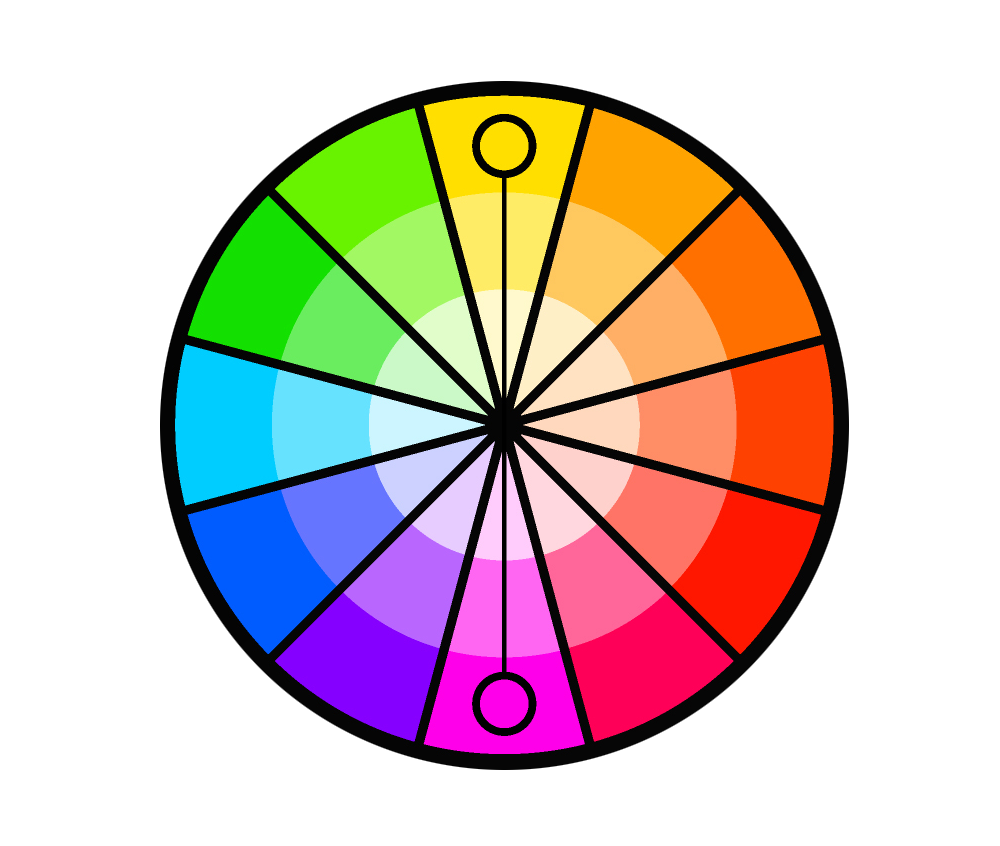
Also known as contrasting or supplementary, complementary colors are the colors that are opposite of each other on the color wheel. At full saturation, these colors create a vivid and bright effect. An example is red and green. This combination is very popular as it is naturally pleasing to the eyes. For this combination to be effective, it’s recommended that you use one color predominantly, generally the weaker color. So if you select red and green, then your artwork should predominantly be made up of green for the best results.
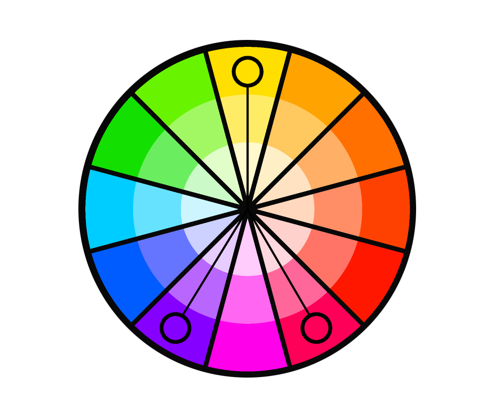
Triadic scheme
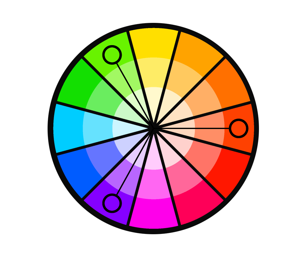
This is the combination of three colors that are equally distant on the color wheel. They create a contrasting effect that is not too harsh, but rather playful. However, this is considered to be quite a difficult combination to pull off as it is vibrant even in the most muted value. If you are going for a more surreal piece of art, or even a cartoon/animated look, this may be the perfect combination to choose.
Analogous scheme
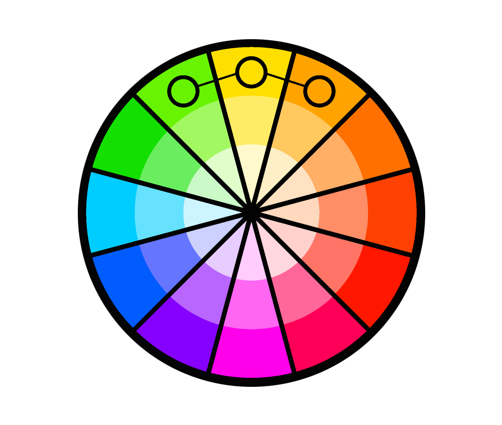
This is when 2-4 colors next to each other on the wheel are used. This combination is easy on the eyes and creates an almost peaceful and comfortable mood. This is because it’s common in nature. For example, blue skies and green trees. So, if you are creating art inspired by nature, this may be the most appropriate combination to use.
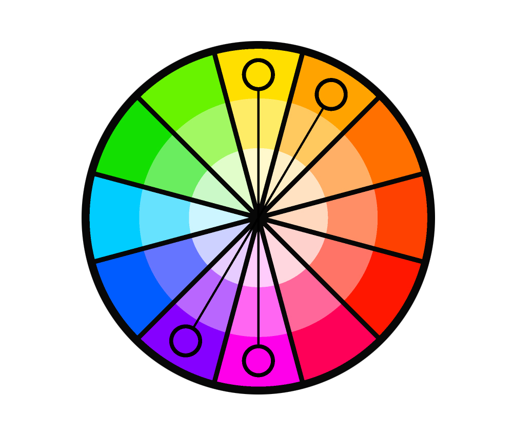
Split complementary
This combination is akin to complementary, but one end is extended. So, the base color and the 2 colors adjacent to its complementary color are used. This allows you greater creative freedom as you are not limited to two colors. This color scheme also feels a lot livelier and more joyous.
Tetradic scheme
Tetradic, or sometimes referred to as double complementary, is a combination of 4 colors in 2 complementary pairs. This way, you’ll have 2 different pairs of opposites to utilize. Its preferred use is for foreground and background paintings. An effective way is to incorporate one pair in the foreground, and another pair in the background. And as recommended with complementary colors it is advised not to use each color evenly (in this case, don’t use 25% of each) as this will create a chaotic outcome. We recommend primarily utilizing the weaker colors, with splashes of the brighter colors to add some much-needed contrast.
How To Create Your Own Color Scheme Using Color Theory
It can seem a bit intimidating to create your own color scheme, however, it is actually a lot more straightforward than many people realize. The color schemes above are a good place to start when trying to figure out what colors go together, but you don’t have to be limited to these set schemes in your own work.
Using color theory as your reference you can create stunning color schemes to compliment your work. Here are our go-to steps to follow when creating a color scheme:
- Consider the context of your art
- Refer back to the color wheel
- Focus on what colors go together
- Refer to the basics of color theory
- Start with one color and build from there
- Don’t let the program you use constrain you
- Practice makes perfect
Creating your perfect color scheme comes with time. We recommend learning the basics and jumping straight to it. The best way to learn and master color schemes is definitely through trial and error. So, take your time, be patient with yourself, and get creative.

Create Masterpieces With Color Theory
Now that you’re an expert on all things color theory, it’s time to incorporate your newfound knowledge into your artwork. At Contrado you can upload your artwork and create beautiful handmade products to display your show-stopping pieces of art. From beautiful canvases to leather bags, your unique art can be displayed for all to see. The ultimate way to bring your art to life.
Why not share your creations and sell your art at Contrado? With the basics of color theory behind you, there is no limit to the wonderful pieces you can create.